When we talk about UX design, we usually think of websites, apps, or digital interfaces. But user experience design isn’t just for the web—its principles extend far beyond screens. One of the most surprising (and effective) applications of UX thinking is in poster design.
Posters are visual communication tools that need to grab attention, deliver information, and provoke action—all within seconds. Whether it’s a subway ad, an event announcement, or a printable poster you hang in your workspace, the same UX rules apply: clarity, hierarchy, usability, and accessibility.
If you’ve ever looked at a poster and instantly “got it,” chances are good that UX principles were at play. In this article, we’ll break down how UX strategies can guide better poster layout and design—and why this matters in both digital and print formats.
What Is UX Design—And Why It Applies to Posters
Understanding the Core Concept
UX (User Experience) design is all about how a person interacts with and experiences a product or system. It focuses on ease of use, logic, emotional response, and flow.
Now think about a poster. It’s not just art—it’s information delivery. A poster has a job to do, whether that’s:
- Announcing an event
- Inspiring an emotion
- Promoting a brand
- Educating a viewer
And just like a website or mobile app, a poster needs to guide the viewer through a specific journey. That’s where UX steps in.
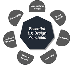
UX Principle #1: Visual Hierarchy
Directing the Eye with Purpose
Visual hierarchy is the arrangement of elements so that viewers naturally see the most important things first. In poster design, this could mean:
- A bold headline at the top
- Supporting text in a smaller font below
- A call-to-action or contact info near the bottom
According to eye-tracking studies, people tend to scan visual layouts in predictable patterns (like the F-pattern or Z-pattern). By understanding these tendencies, designers can place elements where they’re most likely to be seen and processed.
Actionable Tip:
Use larger font sizes, contrast, and bold color to highlight key messages. Stick to 2-3 levels of hierarchy to avoid clutter.
UX Principle #2: Readability and Legibility
Make It Easy to Read—From Any Distance
If your poster can’t be read from 3–5 feet away, it’s not doing its job. UX teaches us that readability isn’t just about choosing a “pretty” font—it’s about choosing the right one.
- Use sans-serif fonts for clean, modern looks.
- Ensure high contrast between text and background.
- Avoid excessive italicization or all-caps blocks.
Keep in mind that posters are often viewed quickly and under less-than-ideal lighting. Just like on a website, your typography should minimize friction for the user.
Bonus UX Insight:
White space improves comprehension. Don’t be afraid of empty space—it gives your content room to breathe and enhances focus.
UX Principle #3: Consistency
Familiarity Builds Trust
Have you ever seen a poster that felt chaotic, like it was made by five different people with no design direction? UX preaches consistency in elements like:
- Font types and sizes
- Color palettes
- Alignment and spacing
- Iconography or imagery style
Consistency in design builds trust, establishes professionalism, and helps the viewer process information faster. Think of your poster as a mini-brand experience—each design element should reinforce your message, not distract from it.
UX Principle #4: User-Centered Design
Design for the Viewer, Not the Designer
This might be the most important UX lesson of all. Great posters aren’t created to impress designers—they’re made to communicate effectively with the intended audience.
Ask yourself:
- Who is this poster for?
- What do they care about?
- Where will they see it?
- How much time will they spend looking at it?
For example, a poster for a music festival might be bold, loud, and colorful. A poster for a professional seminar may benefit from cleaner lines, more white space, and a conservative font.
Printable poster formats are especially flexible here—because you can design for specific contexts, then test and tweak the experience in real life.
UX Principle #5: Information Architecture
Organize Content Logically
UX designers are masters at organizing content so that users don’t get overwhelmed. Posters can follow similar principles by breaking down information into digestible sections:
- Headline (What is this about?)
- Subhead (Why should I care?)
- Body copy (Details)
- Visual cues (Images or icons)
- CTA (What should I do next?)
Avoid cramming everything into one block of text. Structure helps guide the viewer’s journey and increases the chance they’ll retain key details.
UX Principle #6: Accessibility
Make It Inclusive
Great UX considers all users—including those with visual or cognitive impairments. Accessible posters are:
- Color-blind friendly (don’t rely solely on color to convey meaning)
- Designed with legible font sizes and styles
- Simple in language and layout
Accessibility isn’t just good practice—it expands your reach and ensures your message resonates with the widest possible audience.
Why This Matters for Designers and Brands
Posters are a powerful form of communication. Whether digital or printed, they serve as the “face” of your message in a highly visual world.
By applying UX principles:
- Designers create posters that don’t just look good—they work
- Brands ensure their messaging is clear, memorable, and impactful
- Audiences are more likely to engage, take action, or recall your message
So next time you open Photoshop or Canva, think like a UX designer. Consider your viewer’s journey, simplify your layout, and prioritize clarity above all else.
Final Thoughts: Posters That Think Like Designers
In an age where attention spans are shorter than ever, posters must fight harder to earn even a few seconds of notice. Applying UX principles to your poster layout and design helps cut through the noise and deliver a clear, compelling message.
Remember: you’re not just decorating a wall. You’re crafting an experience.
So go ahead—create that printable poster, but do it with the heart of an artist and the mind of a UX designer.